
How we re-invented analytics - from product discovery to implementation
Meet the team: Jovana is a product manager in the reporting and analytics pillar. She led the initiative of re-inventing the analytics experience at InPlayer from scratch.

It’s no secret that analytics at InPlayer were the weakest niche of our product offering. Not being the core product itself and being developed at the very early stages of the product, the analytics and reporting segment of our dashboard provided a very robust solution that ran on outdated php code which nobody wanted to maintain. It additionally caused system errors when large reports were being generated - solely because the system was not designed to handle big data. And having had two sources of truth, one of which was Elasticsearch - a non-relational secondary storage, not intended to be used for report extraction, but for - and the name clearly indicates it - searching, didn’t make things easier.
But all that was not the core of the problem. The main problem with our analytics and reporting offering was that it was not providing our customers the data they needed. In today’s data driven world where business leaders rely purely on data to make strategic business decisions, InPlayers customers were unable to do so because the data that was provided to them didn’t answer their questions.
“This is useless. I don’t know what I’m getting.“
The decision to end procrastination
Reporting was the elephant in the room. Everybody was aware that it’s a problem. And everybody procrastinated solving this problem. Because there were more important problems to solve. Until there weren’t.
We conducted an investigation in order to quantify the problem and found out some terrifying insights on the amount of time spent on crunching numbers - internal and external.
An account manager spent nearly 2 days per month on creating custom reports for their customers
The whole finance team spent nearly 3 days per month on creating custom financial reports for internal and external facing purposes
A customer spent on average 2-3 days per month on creating custom reports, pivoting tables and filtering raw data in order to get to some summarised tables and be able to pull out some meaningful insights about the performance of their business

Until then, the problem had never been quantified before. Everybody knew it was a problem, just nobody knew how big of a problem it was. After revealing these numbers, it was more than obvious that the time is now.
User research - the key to solving the real problems
As opposed to how we did things in the past, we took this time a “slightly” different approach. Putting user research at the core of problem solving, we reached out to our customers and conducted a series of user interviews. It was not a particularly difficult task to do, because InPlayer has a customer advisory board which is essentially a group of customers the product team talks to on a regular basis for product discovery, innovation testing & hypothesis validation. In return they get early access to new features, freebies, and similar.
There were a couple of things we wanted to find out.
How do they use our current data stack?
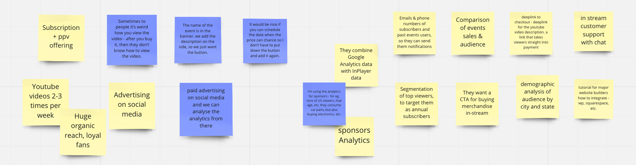
We asked the customers we interviewed to share their screen. We asked them to show us step by step their working routine with the InPlayer data. How do they get it, where do they click, when do they get it. Why do they get it? How frequently do they get it? These questions were important to identify unoptimised user flows on the UI and identify repetitive patterns that can be optimised in the future.
Why do they need this data and what do they do afterwards with it?
The more important question we wanted answers to was - what do they do with the reports afterwards. We found out that the raw exports used to be merged with other raw exports. Our customers then applied filters, pivot tables and aggregations only to come at the end with a basic 2x2 table or a simple pie chart that would showcase the performance of their business.
The key finding was that our customers, if provided with the right information in the right format, actually do not need the raw data at all.
What KPI’s do they monitor?
During our interviews we concluded that our raw data exports are used by internal analysts at our customers' side in order to calculate some of the industry standard subscription metrics, like monthly recurring revenue, customer lifetime value and average revenue per user. It was an expectation that as a subscription management service provider we would offer these KPI’s and metrics out of the box.
Back to the drawing board
Knowing all the information we gathered during the interviews, it was time to get back to the drawing board and start analysing the feedback.
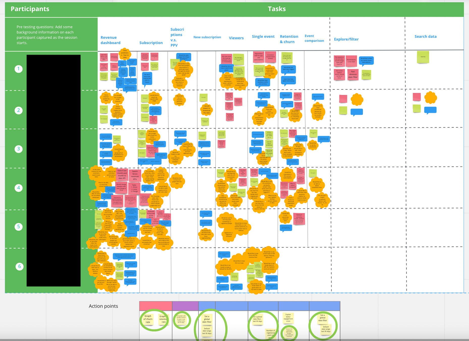
We usually record each interview and have a transcript of the conversation so that we can come back to it later. All those recordings and transcripts were then transferred to a more readable and eye friendly Miro board. The intention was to identify repetitive patterns, pain points and requests.
It was a pretty difficult job. Analysing qualitative data was probably the toughest job of all. Not only because of the nature of the task, but also because our customer base is very versatile. From large enterprises to small independent publishers, with one time concert streamers to VOD subscription based offerings, we needed to find out what was common for all these people in their data needs. And the problem was that there was very little that all these guys had in common. We went back to the drawing board over and over again - until we concluded: There is no one size fits all for this job!
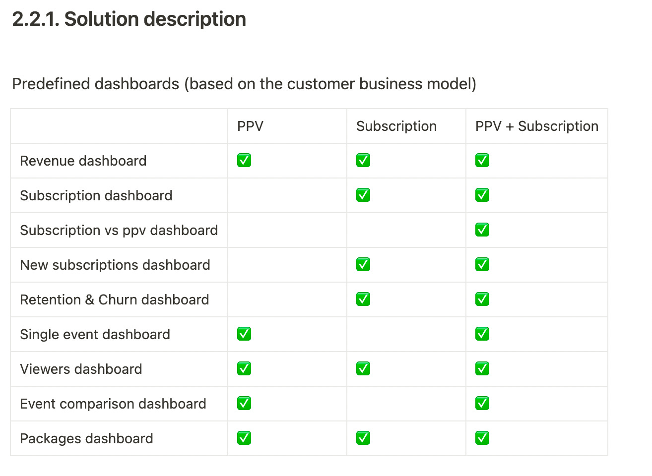
So we came up with the solution that we have today - Business model tailored dashboards. We currently support three business models: PPV, Subscription and a combination of both. So whatever your business model is, you would see relevant data that fits your business model.
Reinvent the experience - Self served data
Once we cracked the main problem, it was time to work on structuring the data and figuring out who gets to see what. Together with the product designer we came up with a set of dashboards that fit more than 80% of the problems we identified.
But dashboards are so 2000 and late. We live in the decade of data. And we live in a data driven world. We can’t always rely on analysts to get us the data we need. Executives and decision makers must be able to quickly get the information they need and make decisions on the go.
We put self served data at the centre of the new user experience. We came up with a solution where customers would not need to drag and drop measures and dimensions onto X and Y axes in order to find out what the monthly churn rate has been over the last 6 months. Our solution simply enables our customers to search for it: Churn rate last 6 months.
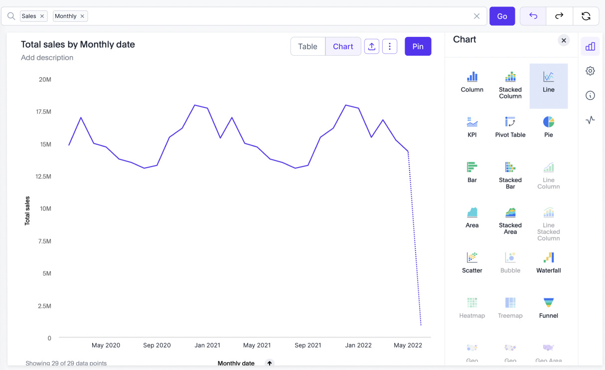
The solution gives a wide range of self served options for data analysis. A graph can be sliced with colour by a dimension so that users can segment the data and gain more insights, there are filters on widget and on dashboard level, the explore mode lets our customers customise the graphs to get exactly to the visual they need, and there are options to add time filters and compare and replace existing data. All in the manner of self-serve.
Validate, validate, validate
Now that we had put it all together, we had to validate the solution with our CAB members, to see if it actually made sense.
Validation consisted of another round of scheduled user interviews where we handed our customers a clickable Figma prototype and asked them to use it and tell us what they saw. The key was not to guide them, but rather ask them to perform an action and monitor if our solution was intuitive enough so that they use it the way we intended it to be used. We had to see if the data provided to them was clear, self explanatory and meaningful. If not, that meant that we would have to go back to the drawing board again.
Luckily enough, our solution was pretty intuitive and satisfactory. After a couple of iteration rounds and small improvements that we implemented during the validation, we were confident that we have the solution that is worth building.
“This is something I would look at every single day. When can we start using it?“
Measure success
The product work doesn’t stop with the validation. As we have just launched our new dashboard as a Beta to a limited set of customers, it is the next goal to monitor user adoption and DAUs/WAUs. Based on current product usage, we aim for 30% of the migrated customers to the new dashboard to be daily active users, and 90% to be weekly active users.
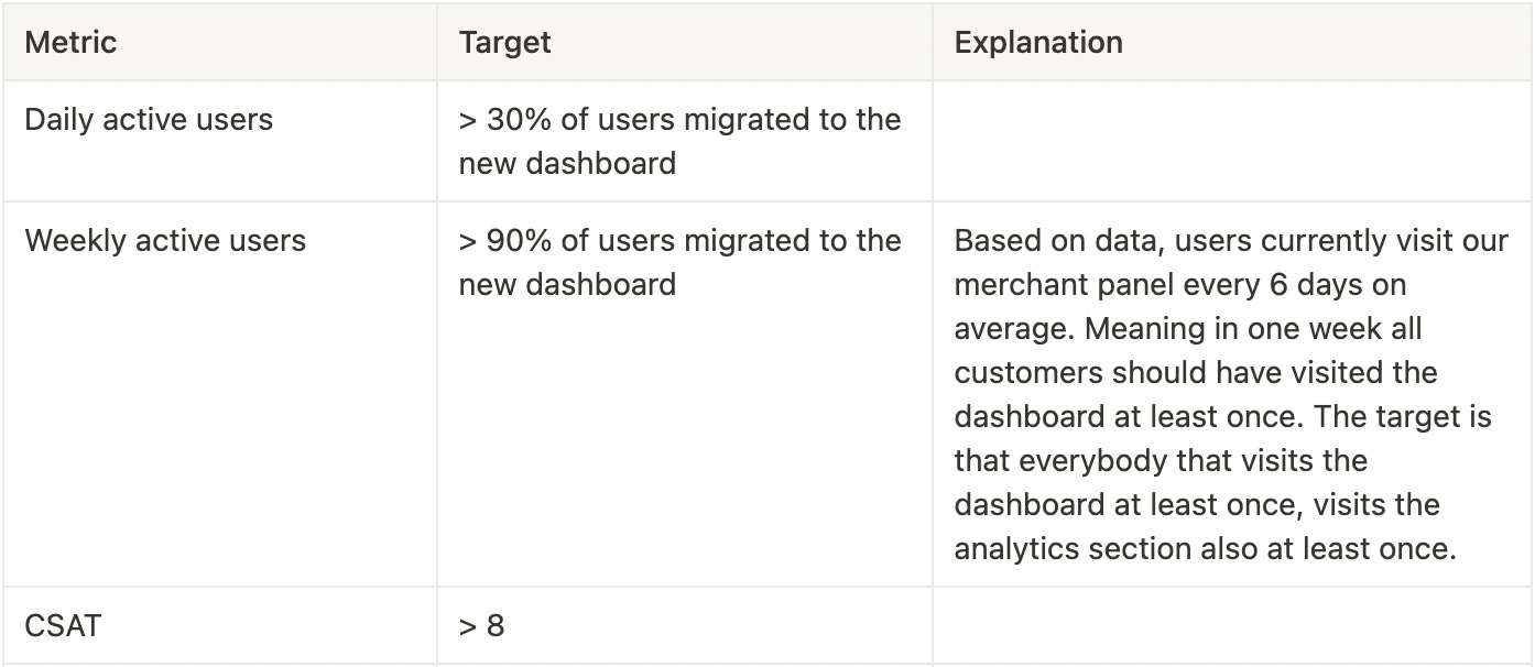
Our go-to-market strategy also involves a customer satisfaction survey, from which we would derive (again) qualitative data about the satisfaction level of our customers from the new analytics experience, but also a quantitative measure on how satisfied they are. We aim for a score higher than 8.
If not achieved, you already guessed it - we’ll have to go to the drawing board again.
Conclusions
A huge part of product work is a very thorough process of identifying the biggest problems users have. We must never start building something unless we’ve made sure that the problem is worth solving and what the outcome of that will be. Investing in time and resources for a thorough research process accelerates the identification of the problems to be solved and helps product managers and executives in making decisions on prioritisation. And it is without a doubt that only product-led companies understand the need and the benefits from investing heavily in user research and validation.