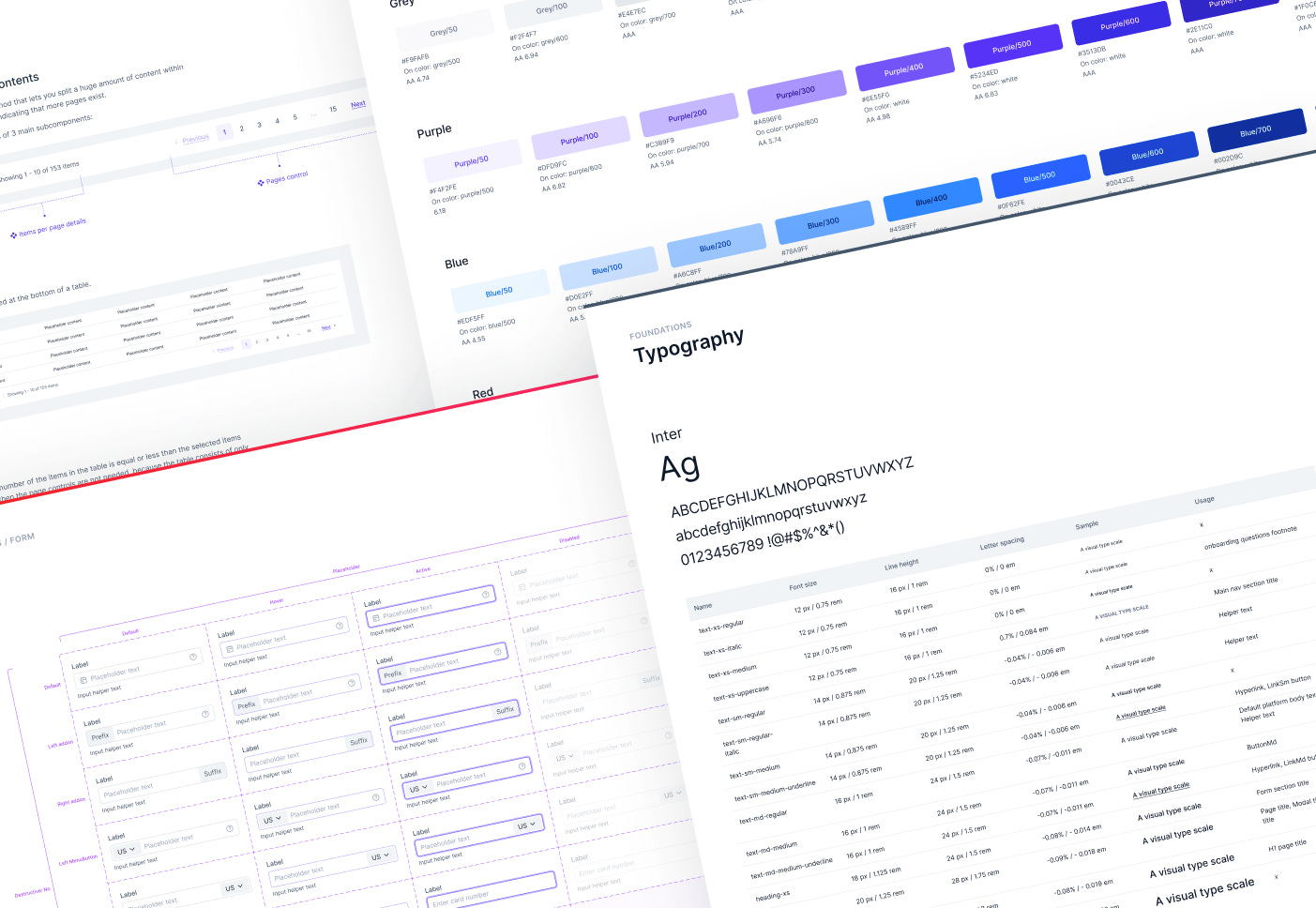
InPlayer's design system "Stream" - Foundations and components (pt. 1/3)
Meet the team: Mia is our CoreXP lead designer of the dashboard and the design system. When she’s not designing, she’s most likely walking her dog Molly.
Welcome to our 3-part case study where you’ll learn how, in 8 months, we built an extensive design system from scratch. We will walk you through all aspects of building a design system, including DS principles, foundations, component best practices and how we integrated design tokens.
Intro
Why a new core experience and a design system (DS)?
The initial version of InPlayer was created in 2010. Since then, the product has expanded significantly, but due to a lack of a design team and design system, the information architecture became confusing, and the UI and UX were inconsistent.
All of our user research led to the conclusion that the dashboard appeared confusing - customers frequently complained that they lacked the confidence to manage the dashboard. As a result, our Customer Success team (Support + Accounts) had to create extensive user manuals, conduct several training calls per customer, and frequently set things up for them.
“I don’t understand how to use the app. On top of that, the app looks completely unprofessional and outdated. I would have switched to another product by now if your competitors had the same features as you do.
But they don’t.”
So, we set a goal to define an MVP and rebuild the dashboard from scratch using a new design system in about 8 months.
Before opening Figma…
As a designer, there aren’t many things that are even remotely as tempting as being given the creative freedom to build a design system from scratch. However, building a design system doesn’t start with choosing your primary colour…
Setting up a goal
The goal that we set for the new dashboard was to build a modern, slick, yet functional and scalable app, that’s self-served. This means that our customers would be able to complete all flows as seamlessly, confidently and independently as possible, without the need for reading long user guides or getting help from our Customer Success team.
This goal became our “north star” and helped us define the goals of the new DS:
Align all teams by giving them a more structured way to build the product.
Speed up our design and development process, i.e. focus on meaningful discussions about the problems and the solutions, instead of discussing styles.
Improve product trust through consistent, familiar and predictable experiences that allow users to accomplish their goals.
Promote accessibility of the product by crafting all styles and components to be compliant with the WCAG guidelines.
Brand audit
To better understand the current state of our existing design ecosystem, we started with a UI inventory of our main interface foundations and components. As a result of this exercise, we identified a lot of inconsistencies, which only proved the need for a more systematic approach to creating, documenting, and maintaining the new design system.
Plan
The brand audit helped us define priorities and phases for building the DS:
Establish the foundations (colours, typography, icons, grids, etc.)
Design the most commonly used form components (buttons, inputs, dropdowns, alerts, etc.) and its variants first
Build the essential flows and features
Slowly build the rest of the components as needed
All of this work was managed in two-week sprints. This was necessary in order to keep each scope digestible, while delivering value in as little time as possible.
Work smarter, not harder
We were aware that we couldn't afford to develop a custom design system on our own because of the rather short timeframe. With the assistance of the developers in the Core Experience team, we carefully examined each of the component libraries that were available and decided to adopt Chakra UI since it met all of our requirements - it’s ReactJS based, responsive, themeable, and contains most of the commonly used components.
The downside of using Chakra UI from a design perspective was that their Figma file was quite weak. Many of the components didn’t look the same as in code, a number of components were missing, some were not responsive and auto layout was not used in many cases.
This made it impossible for us to just copy and paste Chakra's Figma components into our DS. Instead we had to draw every single component from scratch.
Not that we minded…
When we got to the stage of building the foundations and components in our DS, we tried to change Chakra’s styles as little as possible to avoid unnecessary additional dev work. The main changes that we did were colours and spaces.
High level file structure
We followed the atomic design methodology, however we adapted the structure towards our needs. Below you can see a high level overview of our DS structure.
Foundations
When defining all of the foundations of the design system, our main principle was:
Functionality over appearance
Colours, contrasts and tokens
Primary colour
Since InPlayer’s logo is an orange → magenta gradient, from a design consistency perspective it made sense to use one of those colours as the primary colour, but that would have been a bad choice from a functionality perspective. Both of the colours are typically used to communicate warning or error states, so using them as primary colour in a web application can be very confusing and misleading.
Colour palettes
For the primary colour we took inspiration from the lighting that’s often used in cinemas and arena events, and ended up using a “cold” palette, with purple/indigo as a primary colour.
Contrasts
When defining each colour, it was really important for us to also define the allowed foreground shade (aka “onColour”) for each background shade. So for example, on grey/300, the minimum allowed foreground shade of grey would be grey/800 in order to achieve the minimum allowed AA contrast.
We also wanted to achieve colour and contrast harmony not just within each palette, but also in each vertical. For example, since the shade 500 was set to be the main shade in each palette, we made sure that the 500 shade in each palette can be used with a white foreground colour (a combination mainly used for buttons and toasters).
By defining all contrast rules in the DS foundations part, we didn’t have to worry later about contrast in the components, because all of the contrast rules had already been defined.
We mostly used the A11y - Color Contrast Checker plugin, because it allows simple shade adjusting for easier contrast match.
Colour tokens
After defining all of the colours, shades and contrasts, we started defining the colour tokens. The tokens had a crucial role in the consistency of colour usage across all designs and code. For example, if we needed to define a border colour for a form component, we didn’t need to remember if it’s grey/300, grey/400 or grey/500. We simply applied the token form/border and that was it.
There isn’t a single component in our DS with a “loose” style (e.g. Red/300). All components are built with tokens (apart from space, size and border radius tokens, because of Figma’s limitations).
A case study about how we defined and use design tokens is coming soon in Part 2!
Sizes, spacing and grid
We then continued with defining the base units, because how you define the base units will determine the typography specs, sizes and paddings for all components.
We opted for the commonly used 8pt linear scale for elements, with a 2pt and 4pt half step for spacing icons and other smaller elements, which worked well with Chakra’s own base units.
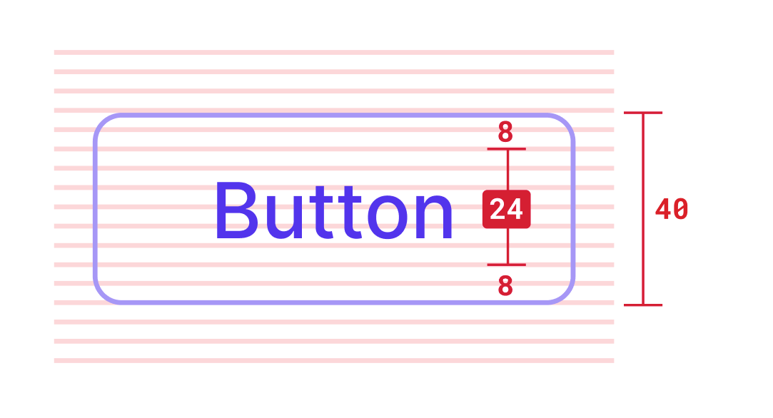
We use 4pt baseline grid for typography which means the line heights are always divisible by 4. This also ensures that when a component contains text + paddings (e.g. button, inputs, etc.), the height of the component will fit perfectly on the 8pt grid.
Typography
Chakra’s font of choice is Inter. This worked perfectly for us, because that was our preferred font too.
We decided to tweak Chakra’s text styles, because we wanted to follow Inter’s guidelines for how to best use the font, while making sure that all of the line heights fit our 4pt baseline grid.
Components
Base component and variants
At the moment of writing this blog post, we have 64 components in total.
All of the components have been formed by using nested base components so that when we make changes, we only make them in the base component, instead of in each variant of the component.
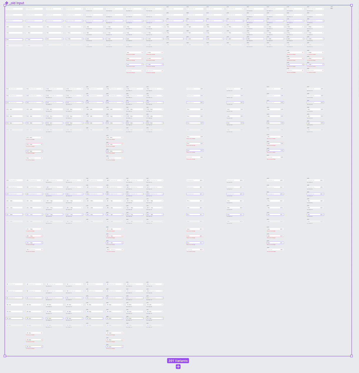
When we started with the design system, Figma hadn’t released boolean properties yet, so most of the components had a ridiculous number of variants. For example, the first version of the Input component pre boolean props contained 391 variants (with 66 variants in the base component), but after reworking the component to use boolean props, there were only 39 variants (with 26 in the base component).
Accessibility
Making the colour contrasts for each component in the DS to be WCAG compliant is not enough to achieve DS accessibility. Some of the things that we also took into consideration were:
Hover and focus state on components which ensures that each piece of UI that’s meant to be interacted with, has defined states for both mouse and keyboard interaction.
Label on Inputs and Selects, as opposed to using the placeholder text as a label, because if a screen reader comes across an input field without a label, it will try to find some text in close proximity to use as the label.
Validation, error and helper texts on Inputs and other form components.
Using double visual cues for messaging components (e.g. Alert) - we’re using icons in addition to just using colour to express intent (success, error, warning), because relying on colour alone is not enough.
Hovering over an IconButton always triggers a tooltip that explains what action the icon represents.
Autolayout
All of our components are fully responsive by using Figma’s autolayout.
Placeholder/slot components
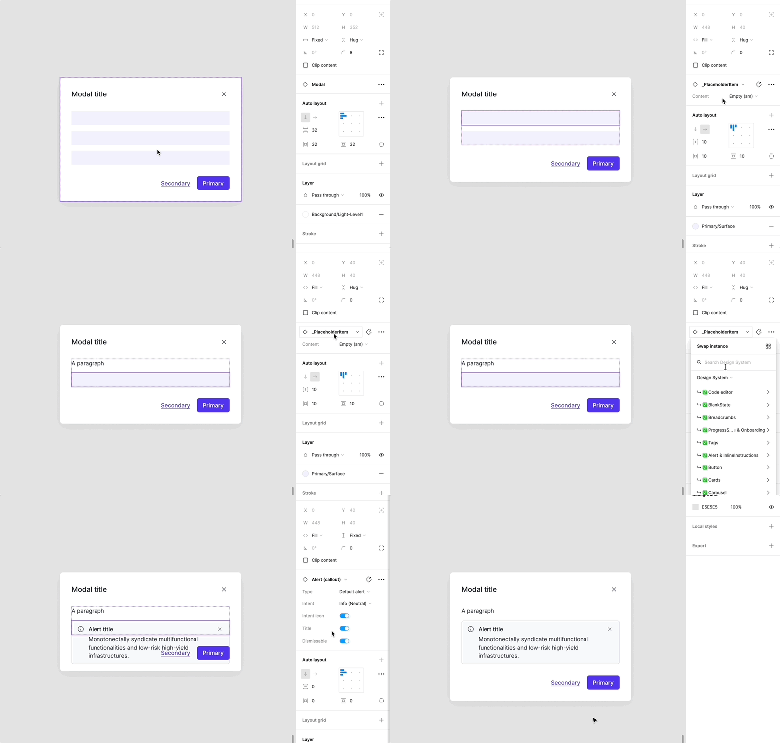
Slot components are one of the best tricks we’ve incorporated in our DS. We use them in all components that need to contain variable nested components or different number of nested components, so that we don’t need to detach the instances from the main components in order to customise the instance.
Pro tip: Nesting slot components
If you need to swap a slot in a component with a component that is built from the slot component, you can create 2 slot components in Figma.
Plugins
Propstar was also a great find that I stumbled upon on Instagram by chance and it cleaned up our DS massively. The plugin generates all possible instances of a component (given that some of them are not shown if you use boolean props), including every combination of variants and component properties, in a labelled table. Even the most heavy components look simple with this plugin.
Component patterns
ComponentPattern is a component stored in the design system, which has been created from a corresponding component in the design system and then overridden with content that’s fixed and appears on multiple screens on the dashboard (e.g. specific page header, tabs, “Save changes” modal, etc.).
We decided to use component patterns because if we decide to make changes to the overridden instances, instead of editing the content in every occurrence of the instance, we would just make changes in the component pattern component.
For example, the PageHeaderPattern where the title is “Video assets” is currently used in hundreds of screens. If we decide to change the title to just “Videos”, we will just need to change the title in the pattern component and simply update the PageHeaderPattern component in each file.
Documentation
Our Figma documentation consists of two parts:
A guide on how to use the component (intended for designers, and devs)
Tokens documentation (mainly intended for devs)
Design fast, test and iterate
Each component in a design system may look absolutely flawless when viewed in isolation as a grid of variants. However, users don't engage with it in that way.
As we were building the foundations and the initial set of components, we were constantly performing visual DS tests. We tested each component in different dashboard pages and UI patterns, in order to be able to see how different components look like when positioned next/close to each other, to test sizes, paddings and margins, and find subtle component inconsistencies.
These exercises helped us identify things that could be improved early on in the design phase, which we would have otherwise missed.
Sometimes, improving a component meant fundamentally altering its structure, which had an impact on the instances of the component used in our design files. Here’s how we handled those situations:
DS sync meetings
We conducted weekly DS sync meetings with the frontend devs from the Core Experience team, in addition to generating comprehensive design tokens documentation, to ensure that our designs in Figma made sense and to examine the components that have been translated in code.
A case study about how we built the components in code is coming soon in Part 3!
We also had sync meetings with the Frontend developers from the rest of the teams, so that all teams are aligned with the latest DS updates.
Conclusion
Apart from following all of the guidelines and best practices for each style and component, one of the most important things to remember when building a design system is to know your users and then build for functionality over (just) appearance. Having a Dribbble-worthy DS won't help you attract new users or keep the ones you already have. It’s your product’s simplicity, usability, and consistency that will determine its success or failure. At every stage of building a DS, keep in mind that you are designing for humans with a range of technological proficiencies, as well as cognitive and visual abilities.


