
InPlayer's design system "Stream" - Design tokens (pt. 2/3)
Sandra is our Director of design and a passionate advocate of Design Systems.

Since our team came together last year, one thing that I knew I really wanted to do once we started the completely brand new Design system “Stream”, was to implement design tokens. If you have previously ever used a unified CSS file with branding variables specified in one place, it’s quite a similar concept.. the biggest difference we wanted to introduce was connecting our Figma files to the codebase directly, adding additional control and unification between the Design team and our Core eXPerience team who took care of the frontend component implementation.
For the ones that haven’t heard about design tokens, I recommend watching one of Jina’s talks who introduced the topic when she started working on the Salesforce’s design system Lightning, and you should check out the design tokens community that takes care of the design tokens syntax and specification, trying to unify the token file formats.
I’ll try to cover our approach and the biggest challenges when deciding on how to proceed by building a design token eco-system with a common language.
Choosing Chakra as a frontend UI library
You can always start building a design system in Figma on the design side. But not syncing with the engineers in the beginning would be a big mistake. It’s much easier to work together if you agree on how you will build both the tokens and the components up front.
Hence, we first wanted to land on a decision on which frontend UI library we were going to use. We were looking for something that works with React, we knew that we wanted to go fast (so we didn’t decide on building every component from scratch), and we selected several libraries that our frontend engineers tried out with a small demo. Besides that, we also checked out whether there are frequent updates and an active community so we knew that the library will be updated regularly.
We landed on a decision to use Chakra UI. Chakra is still quite new, so we knew that a lot of the components we needed won’t be available (e.g. a date/time picker or rich text editor). For anything missing, our engineering team were willing to include other component libraries and customise them to our needs when needed, and building the rest of the custom components from scratch.
Chakra has tokenised components by default (every value that is passed on in a component comes from a single file / source of truth) but they also support semantic tokens. It was a great decision to go with them, having the flexibility to adjust some of the tokens in code directly when needed, in order to fine tune them with the tokens we passed on from Figma.
Conditional tokens are also used, so we could very easily adjust our tokens and palettes if we wanted to introduce dark mode in the future (which we already planned on doing from the beginning), or override a specific state that we didn’t prefer in the Chakra approach (e.g. the shade of the focus color that was not part of the assigned color palette).
The components themselves also support creating variants of the same component, which was very close to what we had in mind in the Figma design files, and it was pretty aligned in the approach we already used.
Overall, their basic styling approach is to have a palette of colours that they apply as a set to any component and use specific shades for different states, and an array of values for sizing and spacing that they apply in the background, but in the components you can choose the component size by using pre-defined t-shirt sizes like “xs”, “sm”, “md”… That gave us the flexibility to both use their native tokens and still apply our own tokens when we wanted to.
Of course, Chakra came also with a fully responsive behaviour and the capability to adjust your custom components with props where you pass on media query sizes without even writing one line of CSS for this. We didn’t need a completely responsive version for our dashboard, but we leveraged this feature wherever we could.
Kudos to Chakra’s team for the approach they used for both providing a great foundation but also an enormous flexibility for adjustments and customisations.
Connecting Figma to the codebase
Having in mind that Chakra already used a specific format for their tokens, we needed to find a way to export the design tokens from Figma into a format that is the same (or almost the same) to Chakra, being able to easily re-format it in code if it won’t match.
We explored the following plugins:
Toolabs: Looked like an awesome tool which provided customised output of the file token formats, but we noticed that it hadn’t been updated for several months and after a brief chat with the author who said he’s deprecating it, we decided not to go with it.
Figma Tokens (now Tokens Studio): It’s by far the most extensive and flexible plugin, but unfortunately it didn’t provide a format that would be useful for us to use in Chakra. They include the internal Figma tokens with “_” and “.” that are supposed to be ignored in Figma’s native behaviour, and the biggest downfall for us was to store all possible tokens in the plugin and apply them from the plugin itself to the whole design file which is a bigger risk on the long run. We still preferred to use the native styles for colours and typography provided by Figma.
Design Tokens: provided a very interesting approach for the spacing and sizing tokens, which was to create a component with a certain width whose value is passed on as a token value. They also have a customisable settings for the format which was very convenient to adjust to the format we needed to import in Chakra.

The pitfalls of choosing Design tokens
The biggest pitfall of not choosing Figma tokens over Design tokens was not having the spacing/sizing tokens available to apply directly to our Figma components, the design team had to learn them by heart and document them properly for the engineering team.
The other pitfall was that it was a bit more difficult to pass on the file in the codebase being able to update through Github (engineers had to create .yml file for this). Unfortunately the file size that we got to pass on was also an issue, and once we hit a specific file size, we were limited on using the expanded/uncompressed format and had to use a compressed JSON output file. Not using the uncompressed file limited us to clearly view the changes of the file in Github whenever a token was changed.
The compressed file size eventually became an issue as well, so we had to compromise on defining all possible component-based semantic tokens that we wanted to pass on from Figma, and stick to the most basic semantic tokens we could define.
I still hope that Figma will integrate all functionalities for the spacing and sizing tokens into their native app and will provide a way to skip the plugins overall… fingers crossed :)
Translating the token values
We also briefly explored Styled dictionary which can transform and save every token in the codebase and reformat it to other types of files, very convenient if you also pass on the tokens to mobile apps in .xml or other formats instead of JSON.
But for us it didn’t provide much value and we decided to translate some of the tokens in code with a custom script that we could have a bigger control on, and not adding one more tool in the whole eco-system.
The design to code eco-system
So, finally we ended up with something like the following chart:
Exporting the tokens via the Design tokens plugin
The JSON file was passed on into our Github account (we created a bot account that handled the generated pull requests)
Then our engineer Kire created a javascript file that slightly adjusted the tokens into the format we needed in Chakra (so I called it Kire.js :D)
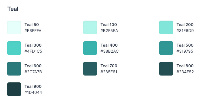
We overrode the default “teal palette” with our “purple palette” which was our primary color to override all existing components, as well as the main font family
We continued to use Chakra’s native tokens, but also introduced semantic tokens to override some values for Chakra’s components (like changing the hover colours of the outlined button version) or use them in custom components
We wrapped all Chakra components into our own components, to be able to handle any updates in the library that might come unexpected from Chakra. We created all necessary components in Storybook where we showcased all possible variants and states of the components. The frontend engineers from other teams could just copy the code and use the component as is, directly into their scope of our new Dashboard.
We had an extensive documentation in Figma and we held several presentations and live coding session to pass on the knowledge to every designer and frontend engineer in the company, so over time we had a huge improvement of the usage of the components and how engineers customised the components.

The troubles of naming semantic tokens
Colours
As Mia explained in the first post, for the colours we used the foundational 10-shade palettes that we didn’t really use in Figma, but were directly applied to the Chakra brand theme provider.
It was fairly easy, Chakra uses color palettes for their overall styling schema where they assign a color value of a scale of 10 different shades from the same palette that we already used as an approach in Figma, we just needed to shift some numbers to adapt it to their format of scale (to use “colour.500” as main, “colour.600” for hover, “colour.700” for active state, etc). We did use the semantic naming for every override and a custom component though, so we didn’t have any loose naming around the code either.
We used the following approach for the semantic color naming: defining a “primary" as a non-colour name but its function, then added the rest of different props and states which included the information whether that’s a background or on-top-of-the-background colour. So both designers and developers know that if you have $primary.main as a background color, you should simply use $primary.onMain as the text colour on top. Viktorija has explained this approach pretty nicely in her blog post “Setting up the most flexible design colour system”.
For the dark scheme that would eventually come, with this approach, we could just use a different palette directly in the Chakra provider that will cover all the dark mode colours with the same naming.
We ended up on a design token naming system similar to the following, where we took the liberty to leave out some of the levels that were really not necessary to define:
[function]-[context (background/onBackground)]-[property]-[state]
We used the same approach for defining all colours that are applied to every form / input type of component so they are all consistent without any shades being mistaken and we avoided any loose ends.
The border of inputs was a specific challenge, cause we had to work with a default border colour, border hover colour, border colour if the input is in focus, but we also had a “danger” variant where we change the colour based on the input state :) We kinda figured it out along the way and this was the most complex naming variant that we went with in “Stream”.

Typography
Translating the typography into the codebase was a bit different since Figma exports everything in pixels, while in code we want a more fluid unit that we could scale up the whole app by zooming in or using responsive styles.

Here’s what Figma exports via Design tokens as a typography style “object” for our text style “text-xs-regular” defined in Figma:
"typography": {
    "textXsRegular": {
      "description": "0.75rem",
      "fontSize": {
        "type": "dimension",
        "value": 12
      },
      "textDecoration": {
        ...
      },
      "fontFamily": {
        "type": "string",
        "value": "Inter"
      },
      "fontWeight": {
        "type": "number",
        "value": 400
      },
      "fontStyle": {
        "type": "string",
        "value": "normal"
      },
      "fontStretch": {
        ...
      },
      "letterSpacing": {
        "type": "dimension",
        "value": 0
      },
      "lineHeight": {
        "type": "dimension",
        "value": 16
      },
      "paragraphIndent": {
        ...
      },
      "paragraphSpacing": {
        ...
      },
      "textCase": {
        ...
      }
    },
...
}
We first used the description field to add the value of the font-size in rem units directly into the file, but it’s not scalable since we also needed this for the line height, letter spacing, etc, and probably needed to parse a big string afterwards.
So, our engineers wrote a small script that basically put the appropriate calculation for the appropriate unit, knowing that we come from the 16px base font size for the whole application and that it translates to 1rem in the code. So it turned out to be a simple math :)
The letter spacing is the only value that is not exported in pixels, but in em so, this only required to add the specific unit. We didn’t parse the rest of the values because we didn’t use them in the design either.
The font family was set once, directly in the theme, and we didn’t really fetch it from the tokens file.
import { getTokenValues } from './formatTokens';

const typography: any = getTokenValues('typography');

const baseFontSize = 16;

export const typographyVariants = Object.fromEntries(
  Object.entries(typography).map(
    ([key, { fontSize, fontWeight, letterSpacing, lineHeight, textCase }]: [
      key: any,
      value: any
    ]) => [
      key,
      {
        fontSize: `${fontSize / baseFontSize}rem`,
        fontWeight,
        letterSpacing: `${letterSpacing}em`,
        lineHeight: `${lineHeight / baseFontSize}rem`,
        textTransform: textCase,
      },
    ]
  )
);
Sizing and spacing
Sizing and spacing were a whole different challenge since they are not yet supported in Figma like the colours or typography styles.
Chakra have their own sizing and spacing scale, that was missing some of the granularity that we wanted to introduce, so we created another system that worked better for us and passed them on as sizes/spaces tokens.
We only used the sizing tokens specified in the Design token plugin for both sizing and spacing, just used different naming. We didn’t use the spacing tokens format, since we wanted an individual padding/margin control instead of a group of 4 values for top/right/bottom/left that they supported.

This was of course, not enough, so besides standardising some default values like “space-md” being “16px” (highlighted in purple), we also introduced some additional semantic tokens that took the values of these basic tokens.
We used them for the detailed component specifications, custom components and all the overrides of the existing Chakra components. We paid most attention to the form elements and spacing between different types of content (form gaps, different titles sizes and descriptions that follow, between different button sizes, layout paddings, etc). We also introduced our own custom form containers that were more suitable to our designs than the default Chakra values.

We could have broken the semantic tokens even in more detail, for example creating different token for each component (e.g. text input, text area, rich text editor, date picker, time picker, etc). But we really wanted to be able to control the same tokens from one place and not introduce complexity without really having the need to do so.
The biggest downside for the designers were to come back to this file all the time to check and apply the appropriate value to the component in its auto layout properties instead of just using the token name as we do with colours. As said before, we’re looking forward for Figma to actually implement native spacing and sizing tokens that would really facilitate the whole design and handoff process.
Border radii
For the border radius we used the same system of the native Chakra tokens, and even though we passed our custom tokens with the same values, we did continue to use Chakra’s native radii tokens and just override some of components’ values (e.g. downsized the value of the border radius on the checkbox).
They are also not supported natively in Figma, so we figured it’s better to use Chakra’s tokens in this case. We just specified in a document which value is used in which component, so we can keep our designs consistent.

Shadows (effects)
The shadows are effect styles in Figma and they are exported as a group of values. We had to parse them into our codebase which would cause another code bloat, so we decided to define the shadows as a CSS value string and pass it on through the description field of the effect and JSON file.
This was mostly done due to the opacity value - we didn’t want to parse the hex value and we used the RGBA color format that included the Alpha channel. But it also enabled us to pass a CSS variable as a semantic colour, for example, to override the focus state of all components.

    "shadowSm": {
      "description": "0 1px 4px 0 rgba(29, 41, 57, .1)",
      "type": "custom-shadow",
      "value": {
        "shadowType": "dropShadow",
        "radius": 4,
        "color": "#1d29391a",
        "offsetX": 0,
        "offsetY": 1,
        "spread": 0
      },
Final thoughts
Could we do this whole thing better? Of course.. we did some smart decisions, but we also failed some. Defining the semantic tokens were one of the best approaches we used, especially cause they kept both the designs and code very consistent throughout our daily work. We could have introduced even more of the semantic tokens if we didn’t have the file limitations, so we could really control the values from Figma directly.
Overall, we are quite happy of what we developed during the past year!
We’re still definitely looking forward to Figma working on the topic of design tokens and have everything done from the same place, in the formats we would need or just in the design token specification. That way we would get the flexibility to pass on values to our codebase in a usable manner, while simplifying the work of the designers and engineers, and keep everything consistent through a well-connected design system.