
Design process customised to our needs
Meet the team: Kristina is our senior product designer on the Integrations team. Driven by the desire to improve viewers' satisfaction she was part of many engagement tools integration initiatives.


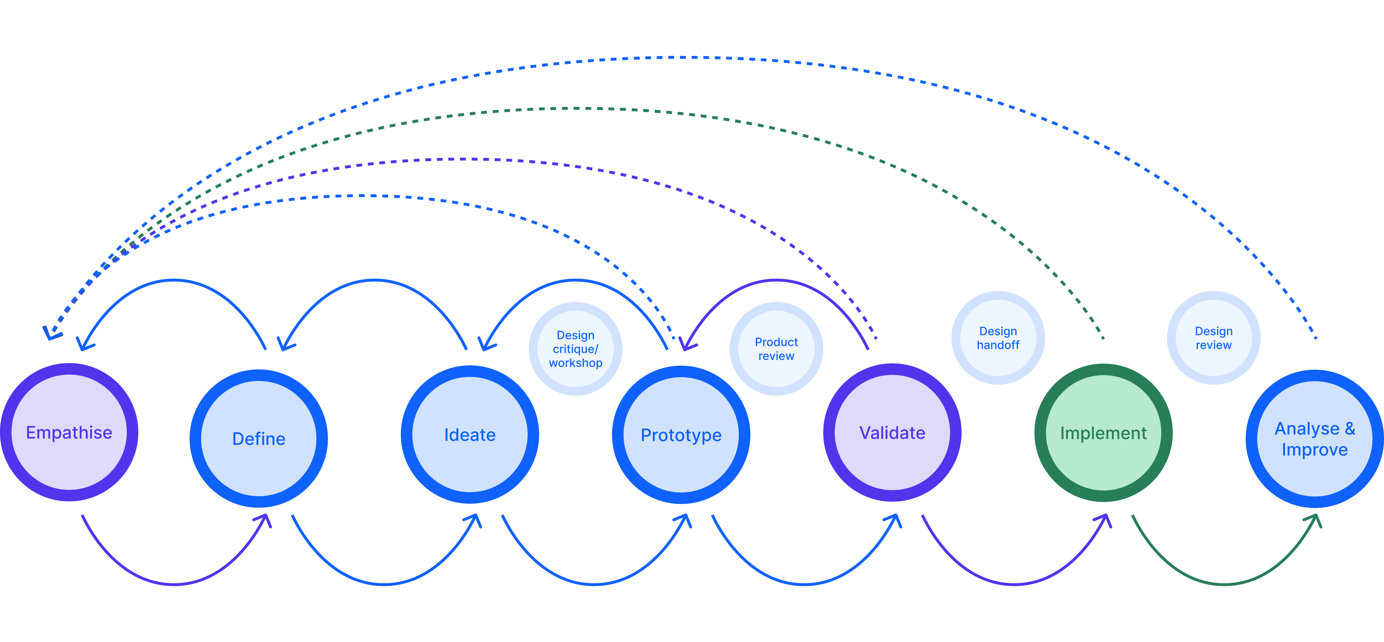
This December I’m celebrating my first anniversary as a product designer at InPlayer. It is also the month we launch our new, completely redesigned self-servicing dashboard that we have built in only eight months. The way the design team achieved this in such a short period is thanks to our structured design process. Our Design Director Sandra previously wrote about how we organize the Design team at InPlayer. As a follow-up, I want to expand on how we customized the design processes to our needs and cherry-picked techniques and tools that suit us best during the complete project life cycle.
At the very beginning
Whether we start a feature from scratch or redesign an existing one, we communicate the high-level goals with the PMs. The aim at this point is for everybody to be on the same page and understand the crucial elements, the problems we might be facing, and the goals we want to achieve from both user and business perspectives.
Since designing for the user experience addresses users’ pain points, we form an understanding of the problems they face and come up with the questions we need to be answered to get there. And that helps us create a design success strategy.
At this point, we are very curious and have tons of questions about the product. This is the crucial moment when we have to slow down and think about all the questions and assumptions we have before thinking about solutions. It is easy to develop design ideas, but it’s hard to solve the right problem. Building a product with lots of unanswered questions introduces risk. To avoid this, we like to take some time to prepare a good research plan.
In tune with the user
We start our research plan in Notion. This is where the questions we will use for our interview sessions are our first project artifacts. We frame the questions more open-ended to avoid prematurely building the solution into the statement. Even more valuable is having team members participate in the question brainstorming, usually the PM, so we can have more diverse input.
After reviewing, sorting, and prioritizing, we have a straightforward question in mind. Now we are ready to turn them into a hypothesis and think about how we would answer them. It’s crucial to have a measurable outcome for the thesis to determine whether it succeeded or failed. Conducting user interviews is one of the methods that has proven to work for us. If we work on a redesign and have an existing product version, we combine it with usability tests. We talk to people, try to understand how they think, act, and feel, and take many notes during the process. We are fortunate to have our CAB (customer advisory board), our base of customer representatives who are willing to help us anytime with such sessions. Also, colleagues from the other company’s departments, like customer success, sales, and marketing, are the ones that are always here, helping us a lot in answering our questions and confirming our assumptions.
Performing 3 to 5 sessions helps us start seeing the patterns, validate or invalidate our hypothesis, answer the questions, and at the end, state the problems. Writing a report helps us summarize all of the notes well organized by the severity of the problem. The idea is that everyone on the product team can easily understand the most significant users' pain points and state their biggest concerns. We present the reports at a weekly Product review meeting where we analyze and discuss them together before proceeding further. When we design a possible solution in the ideation process, the problem statement will serve us as our north star.
Describe the scope
So far, our favorite way of analyzing our research findings is through creating user personas and journey mapping.
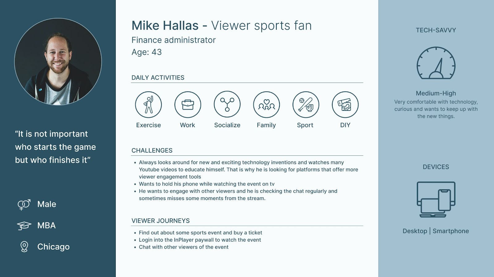
We use user personas to step into the shoes of our customers. We form them by defining their: age, gender, location, occupation, behaviors, budget, needs, and pain points. If we ever encounter a challenging problem, we always refer back to our persona and ask, “What design best services this user needs?” And we don’t narrow down all of our target users into one persona; we create multiple personas to represent our varied users.
We create a user journey map to help us understand what our users will be going through when using our product. Only then can we build the best product for them.
Representing the user’s interactions with our product, we believe that the journey maps are beneficial for
Building empathy
Providing a “big picture”
Breaking down silos
Bringing focus
Revealing opportunities
At the end of this phase, with the problem statement in mind and in close collaboration with our PMs, we write down the requirements and the user stories we need to start working on the solution.
Extract a lot of ideas
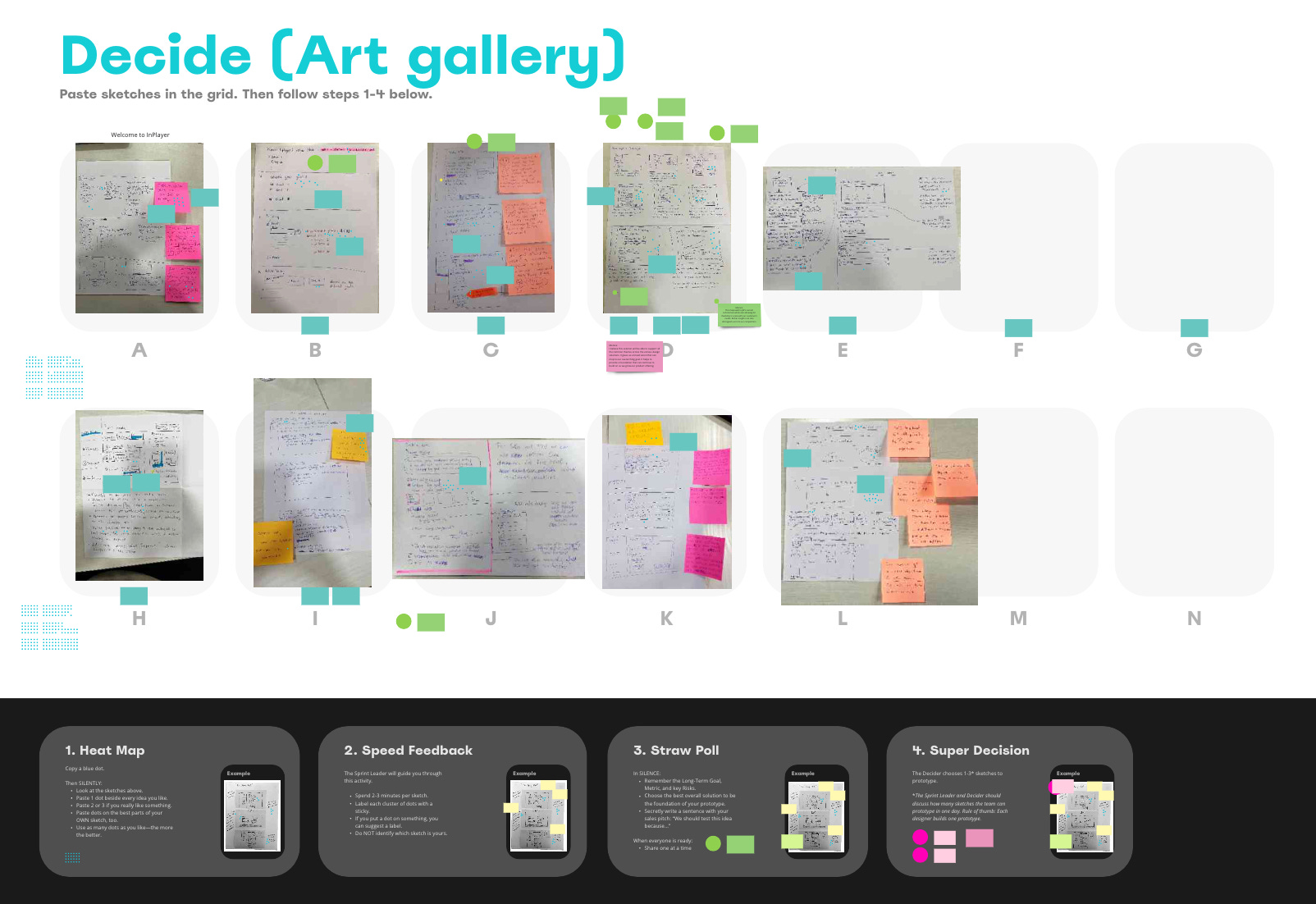
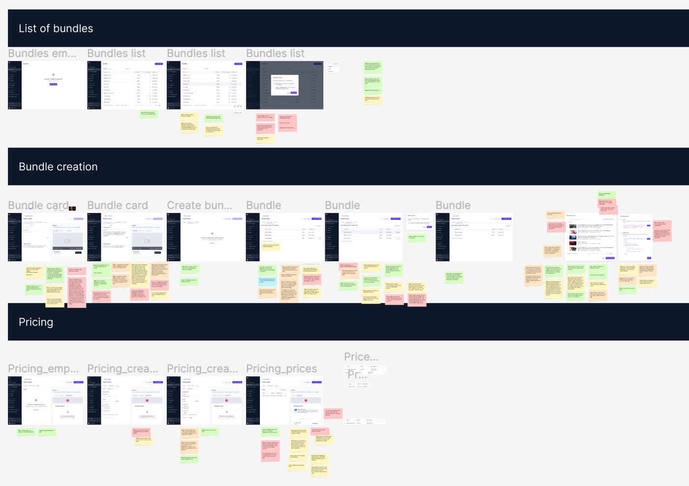
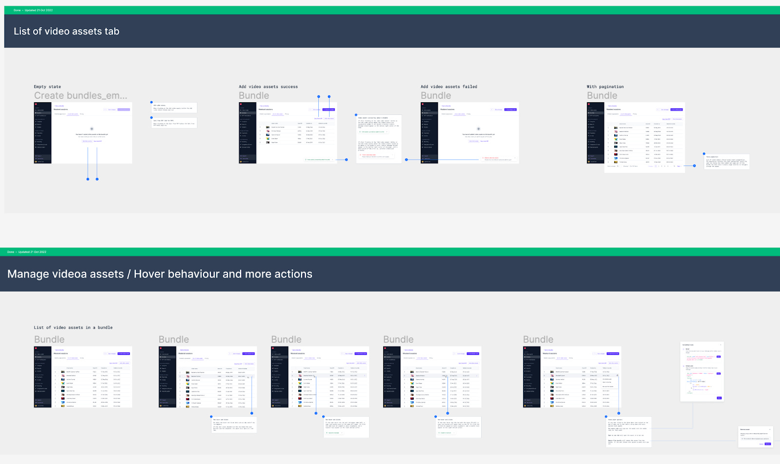
After defining precise requirements, we look at the problem from different perspectives and start to ideate. All designers use different ideation techniques and approach the solution differently. But we all collaborate, try to think outside the box, and explore new angles. Workshops can be organized if needed and don’t always have to be very structured. It’s all about creating as many ideas as possible. It’s an iterative process, and we do not get it all done in the first go; we design, redesign, scrap it and design it all over again. We explore many designs using Figma and our well-known design system. There is a blog post from our dear colleague and design system principal, Mia, where you can read more about Stream - InPlayer’s design system.
Prototype the solution
When design systems were not “the thing,” I used to make prototypes with sketches or wireframes at the very early stage, not focusing on the details but on what needed testing. Now, with our design system, with all rules defined, compliments and patterns created, and even ready-made page templates, the actual design work is more straightforward. We can make high-fidelity designs and focus on the details from the beginning.
At the end of a creative iteration, we are ready to showcase our work and ask for feedback. On the weekly Design team sync/critique, we present the prototype to the design team first. That is the time to get a valuable opinion from the other designers. I love how we all think in different directions and cover many design aspects. Usually, we announce when someone has something for review in our Slack channel a few days before the meeting so we can have it on the agenda. If some design needs quick feedback and can’t wait until the meeting on Friday, we can just send a Figma link in the channel, and the designers will review it when they can and leave us feedback in the form of Figma comments. Whatever the form of feedback is, we have agreed that whoever designer is presenting the work needs to follow these practices:
Set the objectives. Before starting the critique, we reiterate the goals of the work—a quick reflection of the persona, current pain points, user tasks, or previous flows. Sending out the work beforehand with written objectives is our practice to avoid the initial reactive feedback based on someone’s gut reaction.
Present quickly and efficiently. We like to be concise. After presenting, the team can circle back to something that needs more discussion. Sometimes we let other designers see our work as our users may, without much explanation. During the subsequent discussions, questions and explanations will arise naturally.
Pre-prepared designs. We always have them on a separate Figma page, named appropriately by the design version with differences pointed out and the reason we made them. It is good to have the designs available after the meeting in case an extended discussion is needed or someone comes up with an idea later.
Scheduling individual follow-up meetings is also a case if we need to discuss anyone’s feedback in more detail or if something we work on conflicts with someone else's work. Such sessions can happen at any stage in a design process, and usually, there will be different critique sessions for several iterations of the same design.
After “passing” the design team review/critique, the prototype will be presented in a weekly review session to the Product team. Here we get feedback from the PMs and the CPO. Having varied disciplines in the room always brings fresh perspectives and leads to a more productive outcome. Then we communicate the solution with the engineering team and make sure that the solution is technically feasible. Presenting the work doesn’t end here. We show it at the company’s monthly town hall sessions. And if we iterate the design, we do all presentations repeatedly.
Prove the validity
It is already clear that, as designers, our job is to ensure that we create practical and usable solutions. But what does it mean? How can we be sure that we did it right?
There is only one way to find out - test the solution. We start validation well before the product gets built and shipped. Before our team determines whether that new feature we’re building is delightful and easy to use, we run prototype validation to pinpoint critical elements or interactions. Sometimes we find out that many of our ideas won’t solve the problem, and that’s a good thing to find at this stage.
The value of including prototype validation is in getting answers faster. Even if we fail, we fail fast. We always have PMs and/or other designers in the validation process. The designer facilitates the session, and the PM is the note-taker. The testing candidates are usually the ones we did the interview session with earlier in the process. Later, we share the results with other stakeholders. They shouldn’t have to rely on our interpretation of what the user is saying, and we make sure they learn from the user directly, so no matter what the next step is, we are all aligned that it relies on data.
Hand it over
After doing a ton of a great job, and we are sure that we have a version ready to go into development, we do two things: sync with the devs once again to confirm the technical feasibility of the designs. The second, and one much heavier, is creating a well-rounded, in-depth handoff document. Multiple information layers must be conveyed when a design is handed over to the developer. Marking each section’s progress, the devs know what’s work in progress and what is ready for implementation. Using local components we wrap the design system components with relevant content for the project. We describe the interactions in as many details as possible. The research plan and the latest prototype are also linked here. Ultimately, we make sure we mark everything accordingly and attach the document to the relevant tasks in sync with the PM.
In addition to the screens, interactions, and copy, one must share the design system components, specs, and tokens. All these cover different aspects of the design solution and need to collate into one organized piece.
Screens
First, we must name the screens accordingly and ensure that the file name does not possess any versioning. The name of the screen simply describes its function. Plus, we make sure we use consistent casing when naming the screens. Second, archive the rest. At the time of handoff, we collectively chose an option we would build. That is why we highlight the latest version and archive all the older iterations & explorations.
Interactions
Link the latest prototype. It helps understand how the user journey is panning out and allows the developer to plan their approach to code. We add explanatory comments to emphasize specific flows, interactions, or what gets away with platform-specific standard interaction patterns. If the interaction is simple, we do not spend time writing comments about it, and if such an interaction pattern exists, we just add a link to it.
Copy
This is something other than what we as designers do or should do, but we have made some input, even though the majority comes from our Support Team Lead Nikola, who always suggests the best copy for our designs. As a design team, we agree on a Design system copy for consistency, ex. When to use “save“ and “save as“ as a label for a CTA button. We have to include the final copy of our designs in the handoff document.
Design system component
We want to break down the screen and point out what design system components are used, describe the variants we use, and link the component from the design system where a component description and tokens can be found.
Specs and tokens
We have a screens section named /Specs next to each screen. That section is with highlighted design specs usually highlighted using the Outline Figma plugin, and then we write appropriate tokens next to each outlined area.
Last but not least
We specify the max/min sizes of the component and communicate the breaking points and other responsiveness-related information.
Verify the outcome
Limited resources, technical issues, and the timing of releases can impact even the best design implementation. As the design gets passed on from the design teams to the engineering teams, each team can change according to various temporal issues, leading to significant misunderstandings. Ultimately, we realize that the final product doesn’t correspond with the design team’s result.
The designer’s work doesn’t stop when the design goes into implementation. During this phase, we must evaluate whether the developed product aligns with the design teams’ vision, technical possibility, and user experience. In other words, reviewing the developed project helps verify that all visual and technical components are displayed and behave appropriately.
Closure
With many product design processes, the challenge is choosing the right one. Every specific product, team, and company has different needs and goals. But we naturally adopted all the processes to our needs and with good reasons. We believe that having our design process in place doesn’t just give our users an intuitive and pleasurable experience but gives us a chance to iterate and improve our designs and learn along the way doing it.